A curated selection of work by Ian Edmondson spanning almost twenty five years of working within the field of visual communication.
-
![Pop! Typeface]()
Nev Cottee
Pop! A new typeface created in 2024 for the new release by Nev Cottee, the Manchester-based singer-songwriter.
-
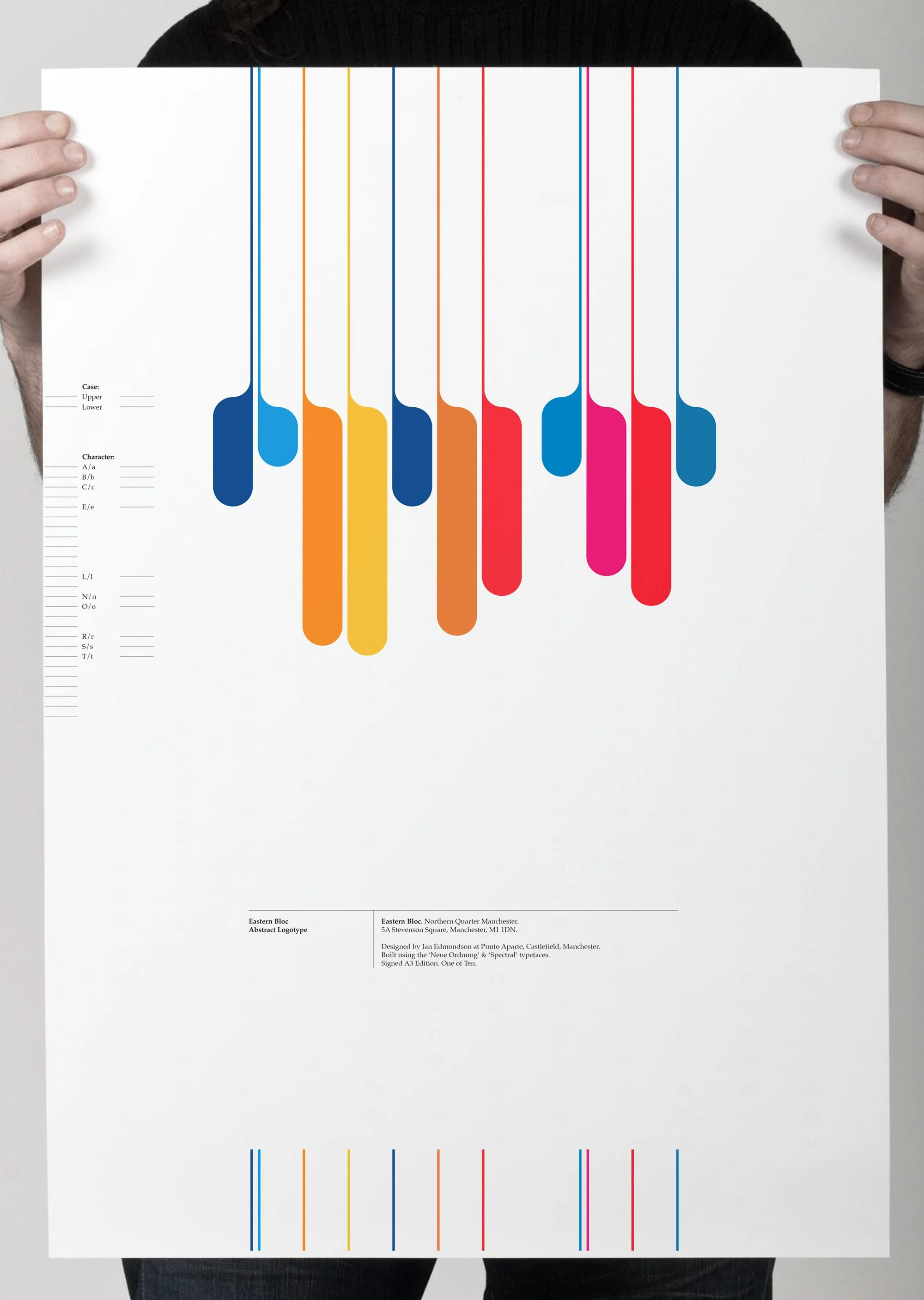
![Neue Ordnung Type Specimen]()
Eastern Bloc Abstract Logotype
Abstract logotype created in 2019 for the Manchester Music landmark, Eastern Bloc.
-
![New Order]()
Neue Ordnung Typeface
A typeface first drawn in 2007 and inspired by the legendary Manchester band, New Order. Soon available to purchase here.
-
![Castlefield Colour Studies]()
Crossley Engine
From a series named ‘Castlefield Colour Studies’ produced in October, 2015. This is the first of six pieces. A six-colour work including a metallic Pantone.
-
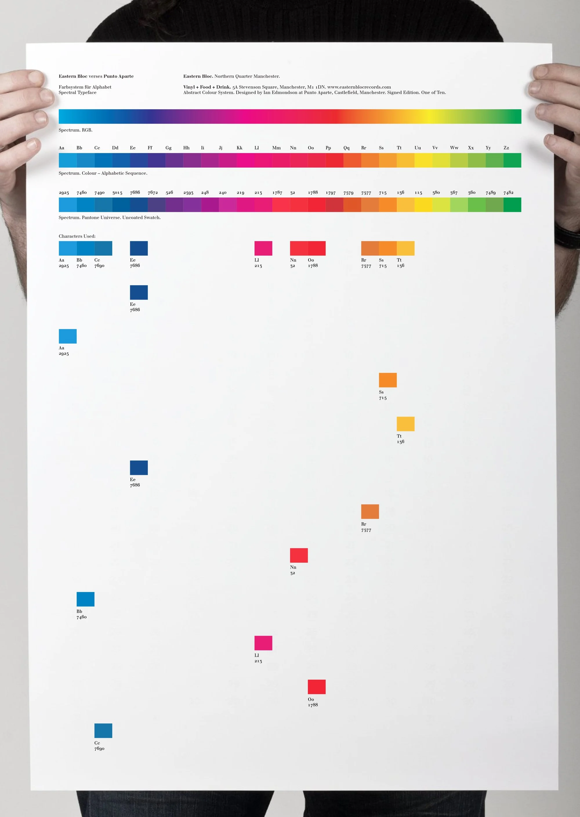
![]()
Eastern Bloc versus Punto Aparte
A poster for Eastern Bloc showcasing the creation of the logotype's color palette, featuring the Spectral typeface designed by Ian Edmondson in 2009.


-
Commercial: If you are looking to enhance your visual communication for your business or project, Punto Aparte Studio may be just what you need. They have experience in various areas including branding, signage, typeface design and printed collateral such as brochures and posters. Their expertise ranges from working with small businesses to larger blue-chip clients, and they have provided consulting services for regional and national events. Ian is committed to delivering exceptional results that are tailored to meet your specific needs. Get in touch with the studio today to discuss how we can bring a professional touch to your next venture.
Education: Ian has experience in conducting workshops where he spends the day with students, giving time to mentor students and guide them through the intricacies of their projects and providing valuable insights gained from his own experiences. Ian can also create projects for students that serve as a valuable platform for collaboration and hands-on learning. These workshops are designed as open environments where students can freely engage with Ian's expertise on the subject matter. Ian is hired on a daily rate basis, allowing educational institutions to benefit from his experience and insights within a set timeframe. Ian believes that when it comes to solving visual communication problems, the first step should be to use pen and paper instead of relying on the computer. While digital tools are becoming more sophisticated, graphic designers can still achieve outstanding results by leveraging the printed medium. Ian can arrange field trips for students to visit professional lithographic presses, where they can witness live projects being transformed into finished products. During these visits, they can learn about various techniques such as foil blocking, additional colours, and spot UV inks, which are crucial for any graphic designer to comprehend. Despite being often overlooked in today's digital world, Ian believes that these techniques still hold great significance and are still the medium in which a graphic designer’s work can achieve the greatest elegance.
Private: Punto Aparte Studio accepts private commissions in which the client can be involved at a root level, working together to answer a very specific brief or creating a one-off bespoke solution or artwork.
-
Ian first began creating letterforms as a teenager in the late 1980s. Often, these forms were not complete character sets but just a few letters to create a symbol or logotype. Upon studying during his degree course he first took on the challenge of creating his first alphabet in 1992, this typeface was named 'Lovebytes' and although a full lowercase alphabet was drawn using a Macintosh LC and Aldus PageMaker, Lovebytes was never made into a typeface you could install upon a computer. These early alphabets were often inspired by Wim Crouwel who Ian found to be a huge inspiration and influence as a student. It wasn’t until recently that Ian revisited these early drawings and decided to turn some of them into installable typefaces. Some of these will be released soon and available to purchase in the store.
Ian has been exploring unconventional and daring typefaces in recent years. These typefaces do not always rely on traditional letterforms. Sometimes, they are based on coded colours or letter frequency, or they may even appear as abstract shapes. Ian finds this approach to be rewarding and thrilling. He admits that he had previously attempted to recreate classical typefaces like Helvetica or Bodoni but quickly grew tired of it. He believes that typefaces such as these are already perfect, and there is no need to modernize them. Even if someone were to point out their technical flaws, Ian thinks these imperfections only add character to the typefaces. As he has grown older, he has realized that he needs fewer typefaces anyway. When he was a young graphic design student, he and his colleagues would carry around font discs containing thousands of typefaces, believing that the more they had, the better they would be. Now, he has fewer than a hundred, plus the ones he has created himself for various reasons or purposes. Ian says, "If he's lucky to live long enough, he could get that figure down to a dozen."
Typefaces coming soon include:
Lovebytes (1992)
Stasis Mono (1995)
Northern Quarter (2002)
Colmado (2003)
Neue Ordnung (2007)
Spectral (2009)
Fone-M (2018)
Pop! (2024) -
Vintage Youth is our outlet for releasing special limited-edition items. Check back soon.